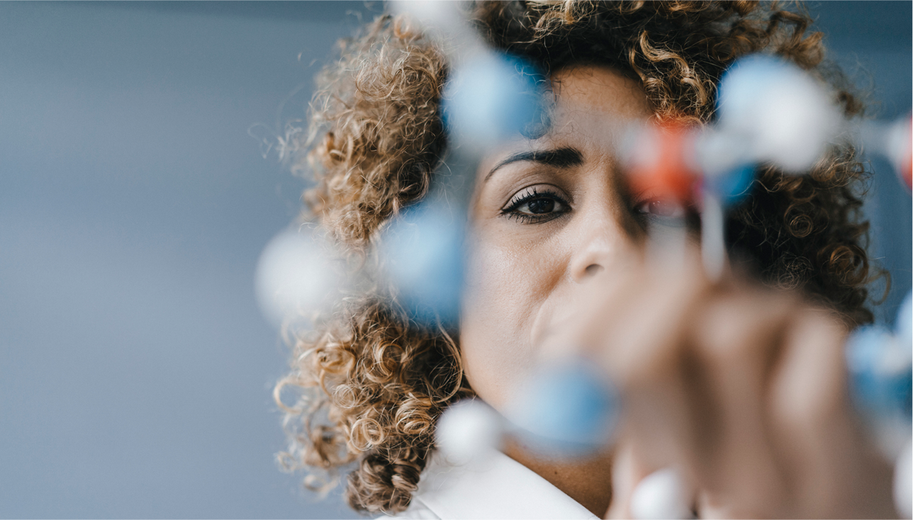
Chromatic
Our chromatic images feature people and products against studio backgrounds from our color palette. This high-energy image style is great for creating visual impact and conveying our energy and passion.
Chromatic products photography
These images showcase our products in bold, branded color environments.
Chromatic people photography
These images capture the energy of our people in vibrant studio settings.


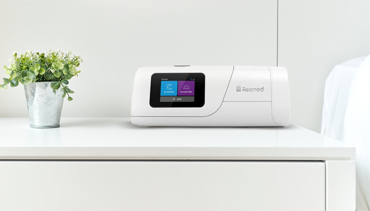
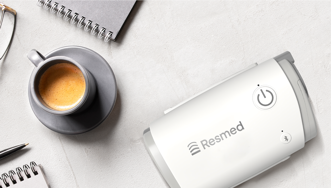
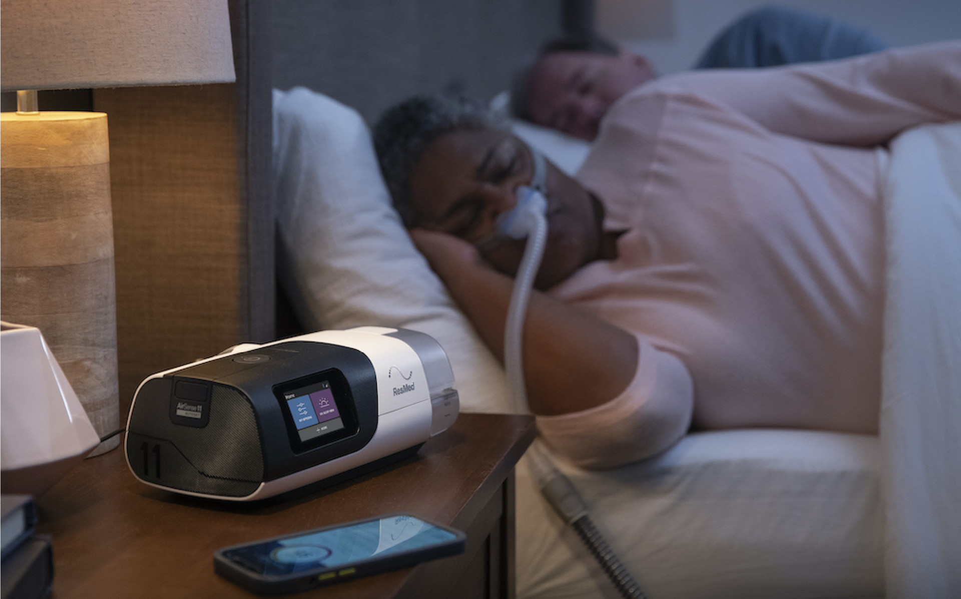
Neutral
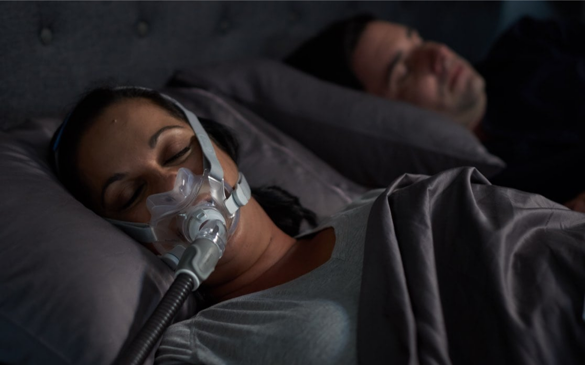
Our neutral images feature people and products in real-world scenarios with clean, light backgrounds that allow the subject matter to shine. The subdued approach to color in these images gives them a calming and stabilizing effect. This may be appropriate for a variety of clinical situations and can also be used to counterbalance the impact of our graphic device.
Neutral products photography
These calm, real-world images let our products shine in everyday settings